Explorer
The Explorer-based components are used, whenever a list of items needs to be displayed to the user and the user needs to be able to select one or more of these items.
Usually the Explorer component itself is not used directly, but one of its
specialized variants, such as NavigationExplorer or SelectExplorer.
Both of them share the same basic functionality, but the NavigationExplorer is
designed to be used for navigation purposes (e.g. showing a list of available elements and navigate the user to the element’s details page when the user clicks on it), while the SelectExplorer is designed to be used for selection purposes (e.g. when selecting one or more items when defining an assignment).
Basic usage
The following code snippet shows a minimal setup for a NavigationExplorer:
import { NavigationExplorer } from '@axinom/mosaic-ui';
import React from 'react';

export const DemoExplorer: React.FC = () => {
  return (
    <NavigationExplorer
      title="Demo"
      columns={[{ propertyName: 'name', label: 'Name' }]}
      stationKey={'demo-explorer'}
      dataProvider={{
        loadData: async () => {
          return {
            data: [{ id: '1', name: 'test' }],
            totalCount: 1,
            hasMoreData: false,
          };
        },
      }}
    />
  );
};
Let’s digest what is happening here:
The two most important properties we pass to the NavigationExplorer are columns and dataProvider.
The dataProvider is responsible for loading the data that should be displayed in the explorer. We pass over an object that contains a loadData method. This method is called by the Explorer whenever it needs to load more data. The method is expected to return an object that contains the data to be displayed, as well as some additional information about the data.
Usually this method will make a call to a backend service to obtain the data. However, for the sake of simplicity, we just return a static array here.
In addition the object the loadData method returns needs to contain the totalCount of all available items and a flag that indicates whether there is more data available. This is used by the Explorer to determine whether it should load more data when the user scrolls to the bottom of the list and to show the total count of elements in the subtitle of the PageHeader.
The columns property defines the way how the Explorer will render the data. In this case we just define a single column, that displays the name property of each data object. The label property defines the text that is displayed in the column header.
In addition we pass down a title to the component. This is used as the title of the page in the PageHeader component.
The last property we pass down is the stationKey. This needs to be a unique string that identifies the station. It is used to store the state of the station in the browser’s local storage. This way the Explorer can remember things like the filter settings to restore them when the user navigates back to the station.
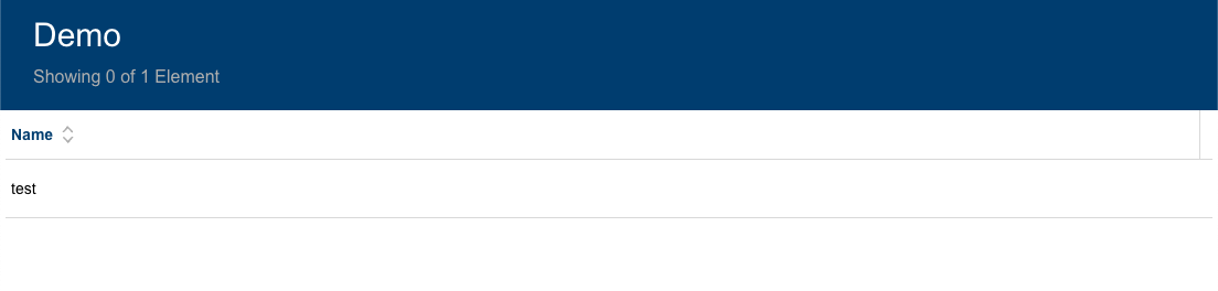
If we add that station to our workflow it will look like this:
Data provider details
There is one problem with the previous example: If you look closely you will notice that the 'Name' column shows a sort indicator, but it is not possible to sort the data by clicking on the column header. Columns are by default sortable. We could disable sorting by changing the column definition to:
<NavigationExplorer
  ...
  columns={[{ propertyName: 'name', label: 'Name', sortable: false }]}
/>
But usually we want to be able to allow sorting of the data. This, and other advanced use cases, can be done by making use of the input parameters the Explorer will pass to the loadData method:
<NavigationExplorer
  ...
  dataProvider={{
    loadData: async ({ sorting, filters, pagingInformation }) => {
      ...
    },
  }}
/>
Let’s go over these properties one by one:
sorting: This argument contains an object containing thecolumnthat should be sorted as well as thedirectionof the expected sorting.filters: This argument contains an object that contains thefilterthat should be applied to the data. The object contains the properties that are supposed to be filtered as well as the value that should be used for filtering.pagingInformation: In case a subsequent page of data is requested, theExplorerwill use this argument to pass over the value that was returned aspagingInformationproperty from the previous call toloadData. The value is completely up to the dataProvider, but it usually is either a cursor or an offset/skip value, depending on the type of pagination that is used.
Currently our Explorer doesn’t allow any filtering, so the filters argument will always be empty. In order to add a filtering option we need to pass down some filterOptions to the Explorer:
<NavigationExplorer
  ...
  filterOptions={[
    {
      property: 'name',
      label: 'Name',
      type: FilterTypes.FreeText,
    },
  ]}
/>
This will make the Explorer render a filter input field for the name property:

There are more filter types available and also the option to implement Custom filter experiences. Please refer to the FilterTypes enum for a complete list.
Now that the filter option is defined, it’s the loadData function’s job to take the potential filters into account when loading data. As stated earlier, the UI library does not make assumptions on how your backend service may look like, so the loadData method can be implemented completely individually to fit your backend. However, if you’re using a Mosaic service as the backend of your workflow, the UI library provides some helpers that make it easier to implement the loadData method.
For the data loading itself the general advice is to define the GraphQL query in a .graphql file
and use the codegen script to generate the corresponding TypeScript types.
The queries on the Mosaic services will usually have a filter and orderBy argument. The filter argument is used to filter the data and the orderBy argument is used to sort the data.
To create the values for these two parameters the UI library provides two helper functions: filterToPostGraphileFilter and sortToPostGraphileOrderBy.
filterToPostGraphileFilter takes the filters argument of the loadData method and an object
that defines the mapping between the properties and the filter methods that should be used.
filterToPostGraphileFilter<MovieFilter>(filters, {
  title: 'includes', // Resolves to {title: {includes: ${value}}}
  tags: ['some', 'name', 'includes'] // Resolves to {tags: {some: {name: {includes: ${value}}}}}
  createdDate: value => {
    const values = String(value).split('|');
    return {
      greaterThan: values[0],
      lessThan: values[1],
    };
  }, // Resolves to {createdDate: {greaterThan: ${values[0]}, lessThan: ${values[1]}}}
});
The result of that function can be passed as-is to the filter argument of the GraphQL query.
sortToPostGraphileOrderBy takes the sorting argument of the loadData method as well as an
enum defining the sort options of the query. This enum is usually generated by the codegen script
and is called {QueryName}OrderBy.
sortToPostGraphileOrderBy<MovieOrderBy>(sorting, MoviesOrderBy);
The method will 'translate' the sorting value to the corresponding orderBy value of the GraphQL query. The return of that function can be passed as-is to the orderBy argument of the GraphQL query.
So a full loadData implementation might look similar to this one:
loadData: async ({ pagingInformation, sorting, filters }) => {
    let filterWithExclusions = filters;

    if (props.excludeItems) {
    filterWithExclusions = { id: props.excludeItems, ...filters };
    }

    const result = await client.query<MoviesQuery, MoviesQueryVariables>({
    query: MoviesDocument,
    variables: {
        filter: transformFilters(filterWithExclusions, props.excludeItems),
        orderBy: sortToPostGraphileOrderBy(sorting, MoviesOrderBy),
        after: pagingInformation,
    },
    fetchPolicy: 'network-only',
    });

    return {
    data: result.data.filtered?.nodes ?? [],
    totalCount: result.data.nonFiltered?.totalCount as number,
    filteredCount: result.data.filtered?.totalCount as number,
    hasMoreData: result.data.filtered?.pageInfo.hasNextPage || false,
    pagingInformation: result.data.filtered?.pageInfo.endCursor,
    };
},
Reacting on changes on the data source
The loadData function will be used to load the initial data and subsequent pages. But there are situations where the data on the backend is changing, after the Explorer loaded it. For these cases teh data provider interface defines a second, optional method called connect. This method gets an object passed that contains methods that can be called whenever a change on the data source happened.
There can be different methods on how the frontend gets informed about a change on the data source. In a typical GraphQL API this is usually done by using a subscription that uses websockets.
This is how a typical implementation using a GraphQL Subscription as event source looks like:
connect: ({ change, add, remove }) => {
    const subscription = client
        .subscribe<MoviesMutatedSubscription>({
            query: MoviesMutatedDocument,
        })
        .subscribe((e) => {
            switch (e.data?.movieMutated?.eventKey) {
                case MovieSubscriptionEventKey.MovieChanged:
                    if (e.data.movieMutated.movie) {
                        change(e.data.movieMutated.id, e.data.movieMutated.movie);
                    }
                    break;
                case MovieSubscriptionEventKey.MovieDeleted:
                        remove(e.data.movieMutated.id);
                    break;
                case MovieSubscriptionEventKey.MovieCreated:
                    if (e.data.movieMutated.movie) {
                        add(e.data.movieMutated.movie);
                    }
                    break;
            }
        });

    return () => {
        subscription.unsubscribe();
    };
}
The implementation uses types and object that are inferred from the GraphQL schema and can be automatically generated and updated using the codegen script.
The code is subscribing to the according GraphQL subscription. The subscription is sending different events, identified by the eventKey. Depending on whether it is a change to an existing entity, a deletion or a creation of an entity, it will use the respective change, remove or add method, to let the Explorer know about the change. The Explorer will then render an appropriate UX for each case.
The method returned by the connect method will be called when the data provider is disposed. At this point the GraphQL subscription is not needed anymore and should be unsubscribed.